CFD visualization – a small how-to and a big surprise!
CFD visualization is the core of my job. And there are so many examples around. So let me share a little how-to today. A quest guide to post processing. A thought process documentation.
Starting with a standard view for your CFD visualization. First, you have to agree on the kind of information you want to transfer. What are you interested in? What quantity shows the core of the simulation?
- For a steady-state single phase flow, pressure and velocity might be the way to go. Maybe an iso-surface, showing where the coefficient of pressure equals zero – or total pressure coefficient in cross section?
- Dealing with conjugate heat transfer, solar radiation, cabin comfort? Heat and temperature are the quantities of your choice.
- Heavily unsteady phenomena, complex turbulence models, LES, IDDES? Show it. How about Q-criterion, vorticity, helicity?
- Multiphase flows? You need to show where one phase ends and the other begins. Free liquid surfaces, volume fractions etc.
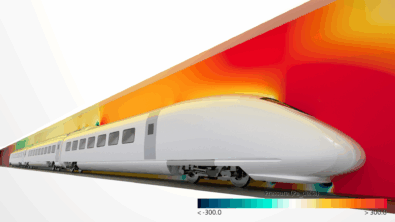
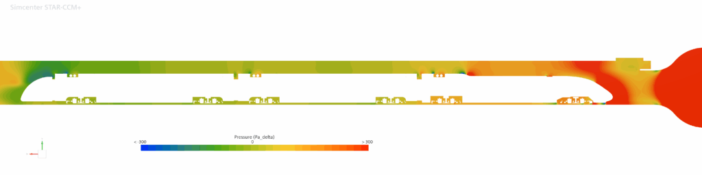
But this time, your use case is the climate wind tunnel for a train. In this case specifically not any train, but a member of our own in-house Velaro Family built by Siemens Mobility. As this is a steady state simulation and you’re not yet inspecting temperatures, pressure shall be the quantity to look at.
You open up your scene, you create a first plane section in the middle of your domain. Drag-and-drop this derived part into the empty scene, select your pressure and… enjoy the view.
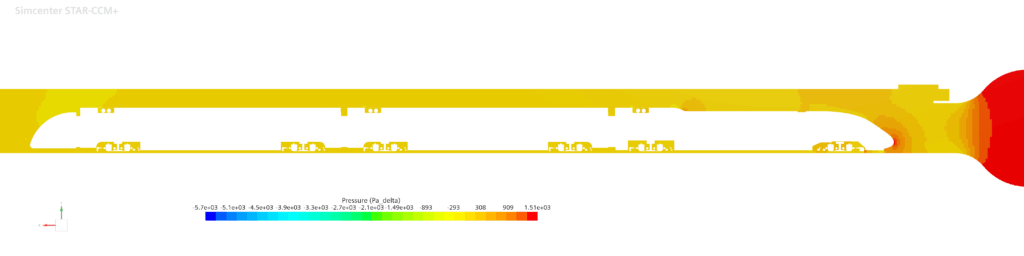
Well, as you can see, you can’t see anything. Or at least: this picture does show the whole domain – but the information you can are close to useless. A plus point for you, unlike the typical CFD visualization – this is image is not 80% green.
Why are all CFD visualizations green?
Doing the steps above, in a lot of cases you end up with a CFD visualization that is mostly green. The reason lies in the auto-setup.
You chose a part and a quantity to be displayed upon.
Your software looks for the maximum and the minimum of said quantity. These limits define the end of your scale. How else should the software know that these are not the limits you are looking for?

In this picture, you already messed around with the number of labels and increased them so much, that you can hardly read which number belongs to which position. But the importance is: two extreme points define your whole scale. And I personally have never seen a simulation where scalar values are distributed evenly over the domain. Most likely, few points show the extremes, and most values lie in the middle. Or better: in the indistinguishable mid of the colormap.
But that alone is not enough to make your potentially great CFD visualization green. It needs another poor choice. Once upon a time, engineers said:
“oh nice, we have that color coding RGB, let’s just use every fully saturated color from 100% blue over 100% green to 100% red.”
(some software engineer, not mechanical engineers! That’s very important to my ego!)
Combining a green middle with a centered majority of values delivers a CFD visualization that’s mostly green. Lucky you, your train is a little offset to the right, so your CFD visualization is yellow. Nevertheless, you cannot read information from that.
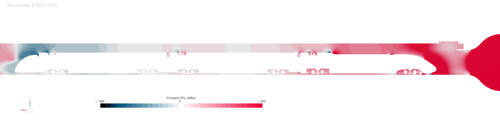
Know your limits!
Adapting your limits to reasonable values enables your CFD visualization to transfer digestible information. Now, you can see zones of high pressure – and negative pressure. All colors from the colormap are present in your picture.
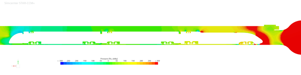
And you have wisely chosen to bring balance to the force (divided by area). Zero pressure is your reference value – and now your colormap represents this. Setting a good min and max is also very useful if you’re dealing with unsteady simulations.
This is a wonderful simulation, but the limits are not fixed. To get the information out of this CFD visualization, you have to simultaneously follow both changing colormap limits and the changing picture. Wouldn’t it be easier if the upper limits were fixed as well? You could even see this rim cooling. But later more about colors. Maybe.
Natura non facit saltus. Your CFD does.
Every cell of your CFD mesh can only have one value per scalar, per time step. That’s the nature of discretization. Nature is not like that. In nature, there are no finite volumes with a high pressure and in the next finite volume there is a constant lower pressure. Still, your CFD visualization indicates that. Let me introduce to you: smooth blending.

You could say: yes, but that’s not my CFD results. You could also argue that this is presumably closer to reality than your CFD results.
You don’t know the power of the green side!
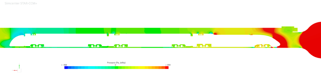
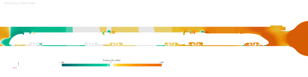
Talking about discrete steps: your colormap also has them. And as you have brought balance to the pressure limits – why not highlight the neutral ground?
Just because it’s 25, it doesn’t mean that 32 color levels are the always-right choice. If you have a true neutral, make it stand out! Changing the number of color levels to an odd number means that you have one distinct color for ground zero in your CFD visualization.
Your eyes can deceive you. Don’t trust them.
Next, you want to get rid of that green. Did you already notice how this is kicking directly into your face, off the screen?

The newer standard of “bright” colors might be more peaceful and less green, but is it great? And does your device show them realisticly, as they are meant to be? Is your display DCI-P3 color-calibrated and able to cover 99% of some-brand-RGB-spectrum?
Monitors might show 100% red, 100% green and 100% blue – but can you claim you see them equally? Not even people with “normal” (whatever this is supposed to be…) color vision can see more than 10 million colors of the 16 million their screens can show. And this is only discussing visibility, not even perception. So here is something more human, uniformly perceived colormap.
This might work perceptually. But you can improve. Or do you like this CFD visualization?
How many colors do you actually need?
One. Or two.
No, I am not kidding, but for a single scalar that changes in value you need only one color that changes in saturation, or in lightness. But as you have a scale with a neutral ground in the middle, you want to use two colors. Something like cold-neutral-warm (note the 31 color levels).
It gets a bit complicated here, because red can be understood as “negative”, but also as “warm” = high temperature. What do you think, should this colormap be inverted?
Or just grab two colors from your company branding, focusing a bit more on the differences around the neutral ground.
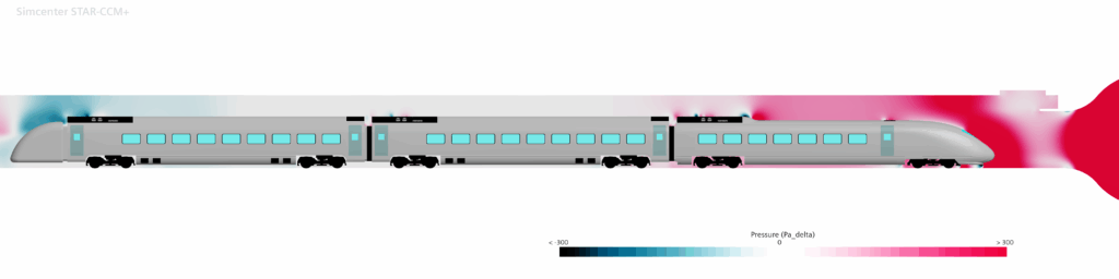
Context for your simulation.
If you have to explain your simulation, you have lost attention.
If your simulation is about the train, show the train.
Show what it is about – and what is beyond!
I can almost hear you say “but the effort…” – how much effort was your simulation up to now? But in any case: you are right. It is effort. But skipping post processing just because of the effort is like aborting a marathon because the last kilometer is the effort. And here are the performance supplements to enable you.
Ray who?
The update 2506 equips our Simcenter STAR-CCM+ with a new hyperdrive: GPU based Ray Tracing.

Before you ask: this is not Omniverse. This is not Unity. This is not Unreal.
We call it Studio Scene, and it is built into Simcenter STAR-CCM+ from Update 2506 on. Build, not bought: this GPU-based Ray Tracing is our own coded solution for faster and more realistic CFD visualization. It is highly interactive, does not require a dedicated license and co-exists with the existing scenes.
I find your lack of hardware disturbing.
What do you need to use the force of this new feature? Ray tracing is executed by Ray Tracing cores (“RT”) on GPUs. You can find these numbers on several sites, manufacturer sites or third parties like techpowerup.com.
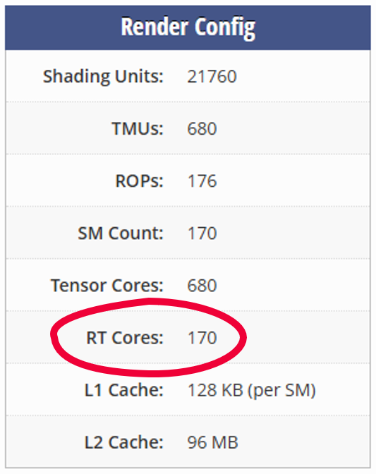
Furthermore, some GPU memory is required, starting at a minimum of 4 GB VRAM. Nothing special when it comes to new hardware, starting below 200 $.
So, how does it feel?
For you and me, the biggest change will be the interactiveness during use. You can navigate around and change the scene, customize displayers, materials, visibility of parts, scalars…
Don’t expect the finished CFD visualization appear real time. But even on my RTX 3070, I can work the full train model without lag. Sure, while navigating, I don’t instantly have all the reflections. Sure, lights take a moment. But this is just the beginning. And an RTX 3070 is by no means the latest and greatest in 2025.
CFD visualization quality is no longer a multi-parameter-tune, but five options from very low to very high. And it’s basically “just” how long the ray tracing runs.
Where there’s light, there will always be reflections.
Ray tracing is but a tool. You need some more ideas how to make it look real. For example, reflective surfaces look way better when they have something to reflect! To make live easier Studio Scene is delivered with an extensive visual material database from which you can pick or derive realistic materials.
Just add some “copies” of your mixing tank assembly in the background behind the camera. How? Use a simple transform!
(Note on runtime and resources: this CFD visualization was rendered in 4k on said RTX3070 and took about 20s per frame to finish)
Tell the whole story.
Last tip: Go the extra mile. Add the whole geometry to it. Give a visual elevator pitch to the topic. Play with screenplay, clipping some geometry, and camera movement. Give yourself the opportunity to impress yourself with your own simulation!
Here’s some work by my colleagues. The simulation itself did not need the tunnel. Not the passengers.
But it does need your pride. Your colleagues’ envy. Your customer’s joy. Your director’s surprise. Your CEO’s benevolence.
And here’s my colleague Timo giving you a full introduction to the Studio Render:
Simcenter STAR-CCM+ 2506 is available since the beginning of July 2025.


