Quality Dashboard | NX Tips and Tricks
Our NX continuous release strategy is designed to bring you updates that increase your design productivity. With our latest June 2023 release, we have focused on just that. For this next instalment of Tips & Tricks, we’ll be jumping into some useful new enhancements in validation. In this post, we’ll be specifically reviewing the quality dashboard, and how utilizing this can really enhance your workflow.
Let’s get into it!
Analyze your quality assurance tests in an organized manner
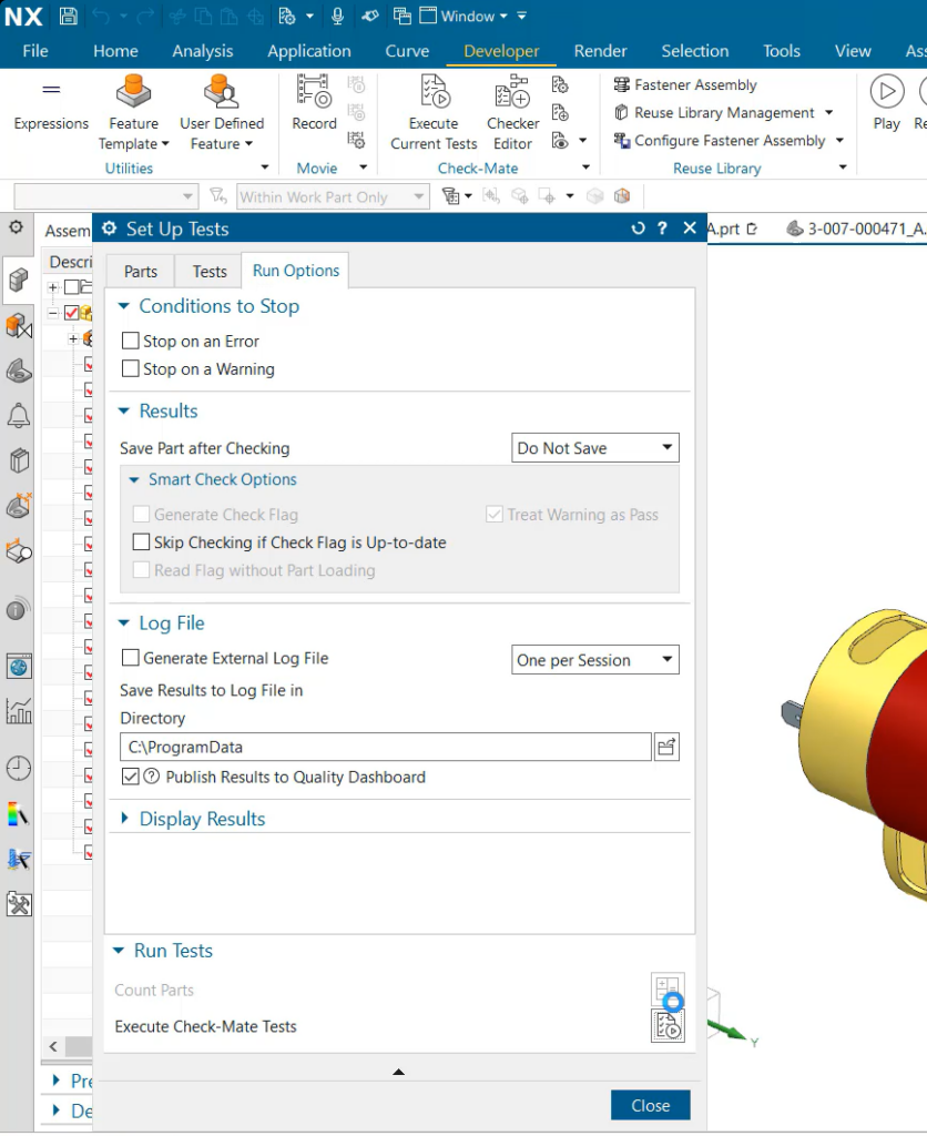
Looking at the first topic we will be diving into is utilizing the Quality Dashboard. This is a handy tool to use when assessing many quality assurance tests at once. The Quality Dashboard provides you with an easy-to-use method to view summaries of the Check-Mate checker results. Not only this, but the tool displays the results in a simple variety of graphs and charts, so you’re able to identify trends quickly and easily in your results. You can of course still view your results in the more traditional format, but this is just a different way for users to interpret the test results – visual learners for example will find this format helpful. Not only this, but having access to the results in graphs, is a very useful tool to have on hand for presentations. This allows our users to demonstrate the development of the product, and how it’s progressing.
Click on a Checker within the Checker Summary Table
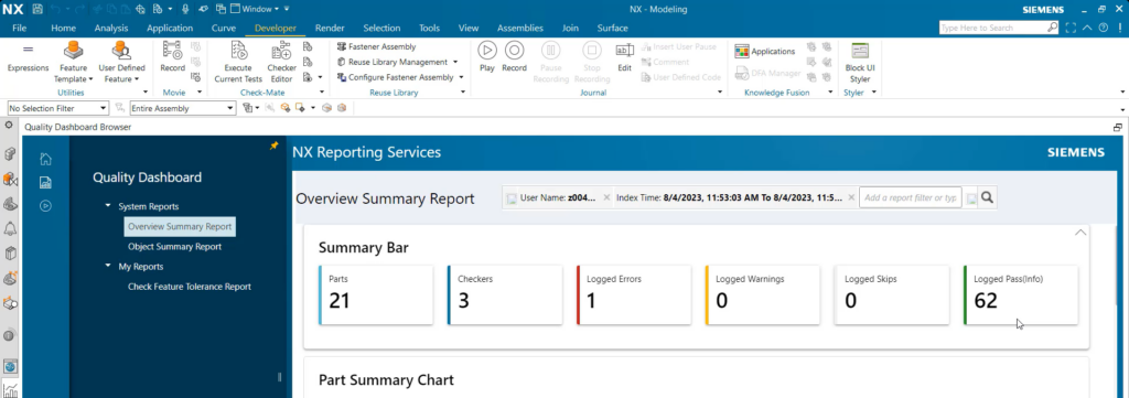
We understand that when Check-Mate provides your test results, there is often a lot of data to review. To keep your Quality Dashboard organized and not overwhelming for our users, we have enabled your data to be simplified down to specific Checker or parts within your assembly by clicking on the name of your checker or part. An additional benefit here is if one checker presented unique results, then it can be quickly explored and analyzed from a more concise view. To note here, multiple tabs can be loaded at once to view these separate checkers and parts. This allows users to have a much smoother overall assembly review.
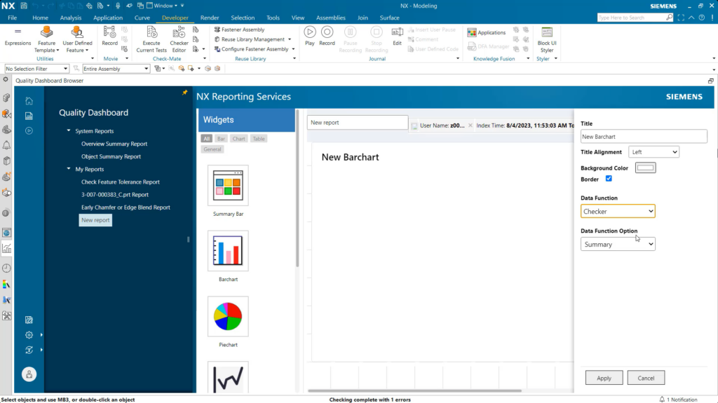
Personalized reports
Experimenting with reports is a great tool that is now available. Everyone has different ways they interpret data, and having this functionality be available to you, we felt was essential to our users. If your Quality Dashboard isn’t showing you data in a way that works for your tests, then you can click on ‘New Report’ on the Quality Dashboard screen. This is where you’re able to customize almost every aspect. From the title of your graphs; to the data function; to even the background color and border!
Continue your journey with NX
And that’s the end of our latest tips & tricks review for validation and Quality Dashboard! Our June 2023 release of NX is filled with handy and useful tools to drive efficiency and reduce design cycle timelines. Keep an eye out for more blogs to come, outlining our other great features! In the meantime, you can learn more about utilizing the Quality Dashboard by watching the video below!