Using simulation data to accelerate autonomous driving development


A changing landscape
For some years now, the automotive industry has been racing to bring more SAE level 2 and 3 vehicles in the streets, and still struggles to deliver a larger offer for SAE level 3+ autonomy. The challenges to accelerate autonomous driving development have turned out to be much more difficult than anticipated, and safe Highly Automated Driving (HAD) is probably as difficult to deliver as successfully launching rockets in space.
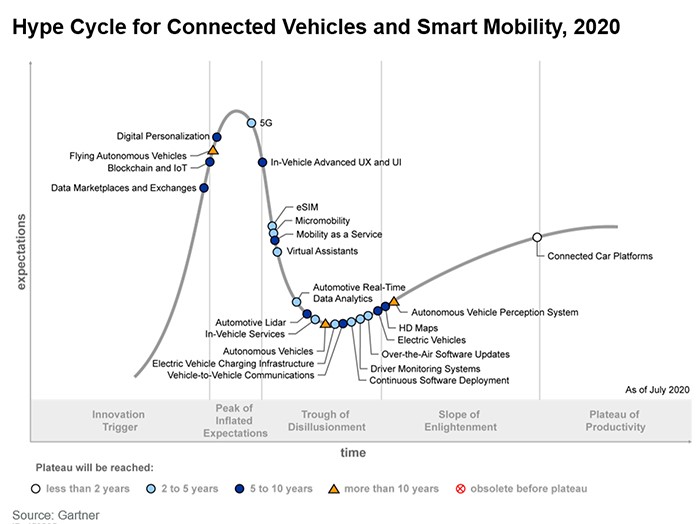
Today it is clear that HAD reached the Valley of Disillusionment in the below hype cycle (Figure 1), and will slowly reach the Slope of Enlightenment. The magnitude of the full autonomy development challenge is now much better measured, and some good progresses have been achieved.
Remaining challenges
One gigantic challenge remaining is the required verification to release HAD systems, which has not yet been overcome for most automotive players. Which scenarios to test? How to produce these scenarios in large numbers? How can I capture enough tricky adverse situations? When am I done testing? When is the system good enough? What is completeness? And other sometimes surprisingly philosophical questions. Also, on the data management side, one can see leading players pursuing large integration of ALM, PLM and simulation tools to keep track of ever-increasing complexity systems, and conduct design, integration and verification activities in a collaborative harmony between more and more contributing departments.
More is not easier
More contributors and collaborative work are necessary to development AD functions, which can result in information not shared, synchronized or traced across departments. More test cases to be simulated probably means better coverage and increased verification confidence. But it also means higher costs in term of computing infrastructure and workforce. A larger result database means potentially more development insight. But usually also means a tougher time to digest it all, not wanting to miss any important failure pattern.
Simcenter Prescan360
Let’s pick this last example and see how to tackle this using Simcenter Prescan360. Let’s imagine you want to simulate a scenario and vary 20 parameters to generate different test cases. These parameters will typically be about actors’ kinematics, weather conditions, road network layout and dimensions, lane markers fading, traffic lights, etc… Assigning only three values to each of these twenty parameters in a full combinatorial way will produce 3^20 = 348,684,401 test cases. Simply going through these cases is impractical and not smartly focused on interesting cases. Interesting cases should contain high variety, should be adverse (but not impossible to pass) and within or nearby the system’s Operational Design Domain.
Now, let’s imagine you’re instead using smarter sampling techniques, allowing you to focus rapidly on the more interesting cases. Adaptive Sampling for instance (Simcenter Prescan360’s AI-guided test cases generation), or our critical scenario generation techniques, effectively reducing the needed number of test cases.
Result analysis
When the results come back, you would like to easily understand the failure patterns looking at a single representation. A simple approach would be plotting the results on a 2D, X – Y plot. The X and Y axis representing two parameters out of the 20 varied parameters. This will probably result in a graphical mess, where no pattern is clearly visible. A HAD system failure, as in real life, will very rarely be determined by only two parameters. System failures will result instead from a set of unlucky and rare combinations of many small factors. Therefore , in general, it cannot be represented in a poor 2D projection in an understandable manner
Sadly, we can’t directly visualize things in more than three dimensions. Even though we would need to understand a 20-dimensions result space. This is why simulation outcomes need to be represented in a special way, abstracted from a lot of information of many dimensions. Ideally, they would need to be arranged in a two-dimensional way, to make it easier to digest it all.
Arrangements by HEEDS
HEEDS, as part of Simcenter Prescan360, features a Self-Organizing (SO) map which the user can create with a study test case. A Self-Organizing map is an unsupervised learning technique to display patterns and relationships in data, like clustering. It distributes data samples, for example, test cases, over a 2D grid of cells. Each cell contains simulations with a set of similar characteristics (based on inputs and/or outcome), which the user can configure, deciding on which aspects he wants to see simulation results sorted.
The map will keep similar cells near each other and dissimilar cells farther apart. Self-Organizing maps show data relationships that are otherwise difficult to visualize. This is particularly helpful for higher-dimensional data analysis than 2D or 3D.
Automated outcome classification
It is possible to manually define criteria for outcome classification of the result space. This method is suitable when the user is looking for a specific and definable outcome type. He or she can then implement this outcome type as rules or conditions over the response variables. This approach can however not be used when searching for unknown patterns.
Using Self-Organizing maps is an efficient way to distinguish simulation outcome classes when the behavior of the system under test is mostly unknown.
Similar testcases
Figure 2, shows an SO map configured to automatically classify simulation results to 4 classes based on the output metrics. This very coarse “4 classes” granularity is applied for the purpose of introducing the concept.
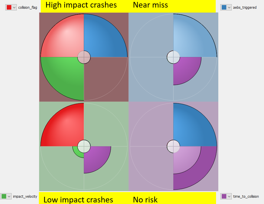
The SO map in figure 2, automatically identified 4 classes. The interpretation of these classes is the following:
- High impact crashes: These are crashes with high value impact velocity (red quarter: collision occurred, green quarter: high impact velocity, blue quarter: AEBS mostly triggered emergency brakings) implying severe crash consequences.
- Low impact crashes: These are crashes with low impact velocity (notice the smaller green quarter) implying relatively lower crash consequences. AEBS never triggered any emergency braking in this class.
- Near miss: These are situations when the ego was not involved in the crash, sometimes thanks to the AEBS (blue quarter), but with a short minimum time to collision (small violet quarter) implying a close encounter.
- No risk situations: These are situations when the ego was not involved in the crash, and the minimum time to collision was always in a high range (indicated graphically by the stronger violet ring quarter) implying a non-adverse situation.
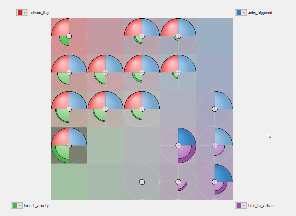
You can then configure the SO map to yield more numbers of classes by changing the cells per side value. In the figure 3, we set the value to 5.
Insights on symptoms and root causes
SO maps graphically distributes the classes (colored circles) across the map so that neighbor classes are always the most similar to each other within the complete result set. This means that the distance between two classes represents their dissimilarity: if two classes are far from each other, this means what happened and the outcomes during simulations of both classes are very different. For instance, the SO maps in figure 2 and figure 3 arrange classes with severe collisions (top left) far from classes with high minimum time to collision (safe cases, bottom right), diagonally opposite to each other in this example.
The SO maps are also useful to get some quick insights in the behavior of the system under test. Figure 2 illustrates that the AEBS system did not intervene/trigger during the low impact crashes, implying inadequate performance, which is useful information to guide the search for the root cause.
Mapping outcome classes to test case characteristics
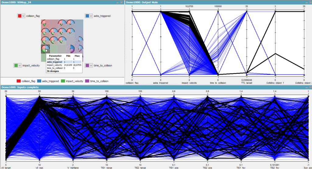
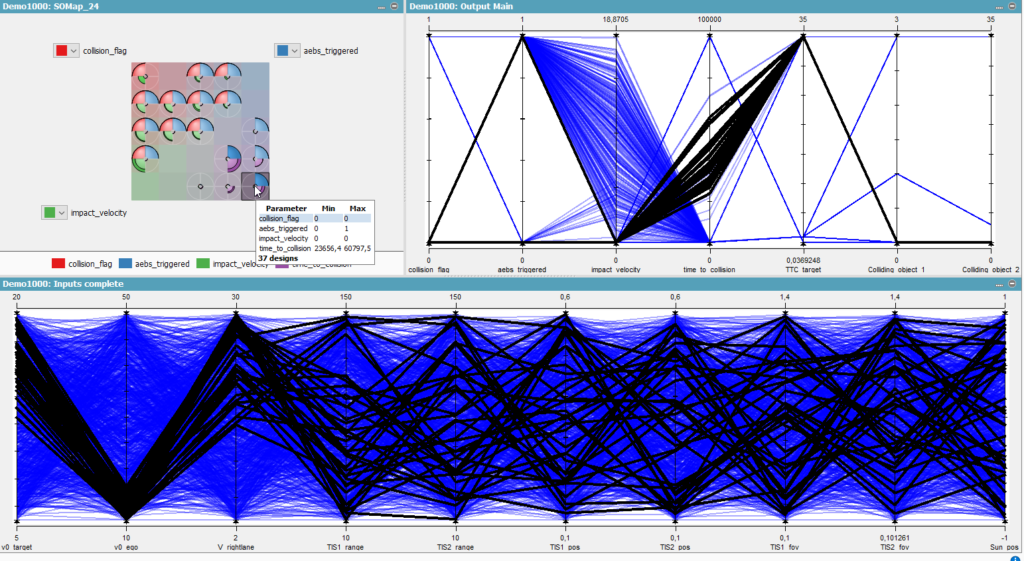
Once the similar test cases are classified by SO maps, the user can view the corresponding input variables via a parallel plot. This way the user can quickly identify if there are any peculiarities in terms of input conditions. Few examples from the study mentioned above are listed below.
Figure 4 – The top right parallel plot shows broken lines from left to right. Each broken line corresponds to a simulation and follows its own path on the multiple Y-axis from left to right. These Y-axis are about result metrics describing the outcome conditions. The selected simulations on the SO map (top left) are highlighted as black broken lines in the parallel plots. Looking at the bottom parallel plot, most of the high impact crashes occurred when the velocity of the ego vehicle is relatively high (40 – 50 m/s) and velocity of the cut-in car to be 5 – 15 m/s. Given that the simulated road stretch is curved, one can investigate whether over speeding was causing the ego vehicle to drift away from the roadway.
Figure 4 – On the “Collision ID 1” and “Collision ID 2” axis at the far right, it can be seen that ego (ID=3) was involved in crashes with right lane vehicle (ID=1). This supports the hypothesis that the ego vehicle drifted away to the right lane, providing sufficient motivation to investigate the stability of lateral controller at high velocity.
Figure 5 – Looking at the bottom parallel plot, most of the uneventful or safe test cases occurred when the velocity of the ego was relatively low (10 – 20 m/s) and the velocity of cut-in car was in a similar speed range (10-20 m/s). This suggests that such test cases can be excluded from further testing by adjusting the parameter range of target and ego velocities.
To find out more about Simcenter Prescan360, please feel free to contact us here.