You will never regret time spent blowing bubbles

If I tell you bubbles, what you would you say? Probably not post-processing CFD results, right? The first thing that comes to my mind is fun! I picture myself as a kid blowing bubbles and staring at them flying. I remember following their trajectories and hoping them to last as long as possible. That’s funny how such a simple thing could amaze me back in the days. And most of all, still amaze any kid in today’s high-technology world. It really comes down to children discovering the beauty of physics without knowing it! I was far from imagining that a couple of decades later, I would use another form of bubbles in a totally different context. A sort of bubbles that would make me super excited all over again and nostalgic at the same time.
Bubble plots in Simcenter STAR-CCM+ v2020.2 are a new way of analyzing and communicating your results. It allows you to add multiple layers of information on a single XY plot when post-processing CFD results. This way, you can easily digest complex sets of information to better understand your product behavior. And this not only for a single simulations, but also for design exploration studies.
You will not believe how many bubbles one design can blow – until you are post-processing CFD results
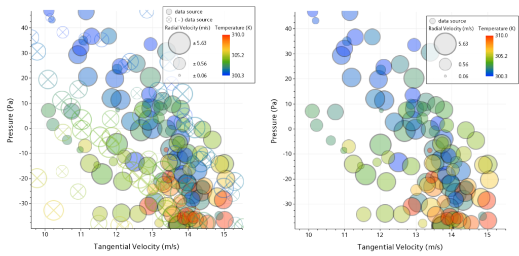
The four plots below nicely illustrate the progression from a regular 2D plot to an advanced, multi-dimensional one using bubble plots for a rotating fan case. The first plot is nothing more than a regular XY plot where tangential velocity and pressure are proudly highlighting their relationship. By switching to a bubble plot style, we can add a third dimension to our data set. That’s where the radial velocity enters the arena with the help of the bubble size as illustrated in the second plot. But what am I hearing? The temperature is now jealous and claims that it is the most important game player. It decided to force the entrance to defend its position! Fortunately, we have the bubbles’ color to avoid a diplomatic incident!
This way, we can now serenely analyze the relationship between our four different players in the third plot and identify trends in our product behavior. And if we are interested in only part of the information, data focus is our friend here! It will help us filter the data based, for example, on vorticity magnitude. This way we can focus on how prevalent high vorticity is on the fourth bubble plot.
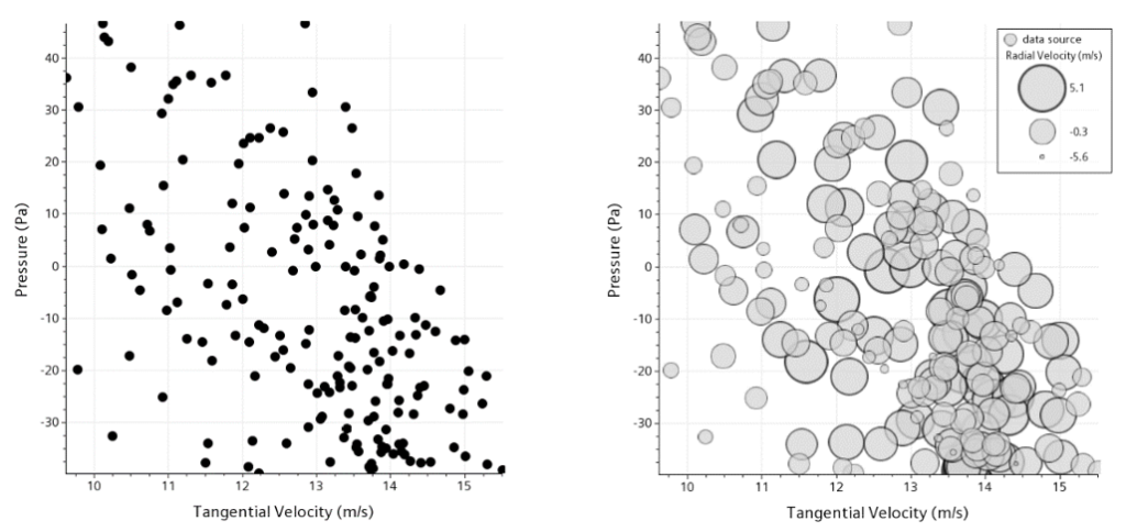
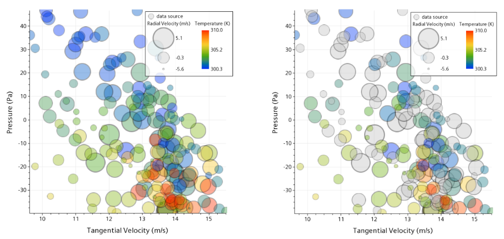
Bubble plots are also flexible enough to be scaled using linear (default), log or area. For log or area, any negative value in the data source will be visually represented by a circle with an inscribed X. You also have the choice to hide these negative values if needed.
Better understand the outputs of transient simulation with bubble plots
Another use for bubble plots is to better understand the outputs of transient simulation with complex physics. The video below illustrates a helicoidal mixer with a non-Newtonian fluid inducing mechanical stress that can cause failures. The objective here is to understand where and why our system could break. For that, we monitor the Von Mises stress and the stress mean values.
So what do we learn when post-processing CFD results with the newly implemented bubble plots? It is interesting in this video to see the evolution of these two critical variables across time and speed. Obviously, the more we increase the rotating speed, the more the system is subject to severe stress. We also notice two families of failure configurations represented by either large and red bubbles or large and blue bubbles depending on the displacement value and the axial position. These families correspond to the junction between the helicoidal spiral and the connecting edges. They are also existing for displacements below -12mm and we notice a strong correlation between the displacement and the Von Mises stress.
100s of designs? Use the bubble machine for post-processing CFD results!
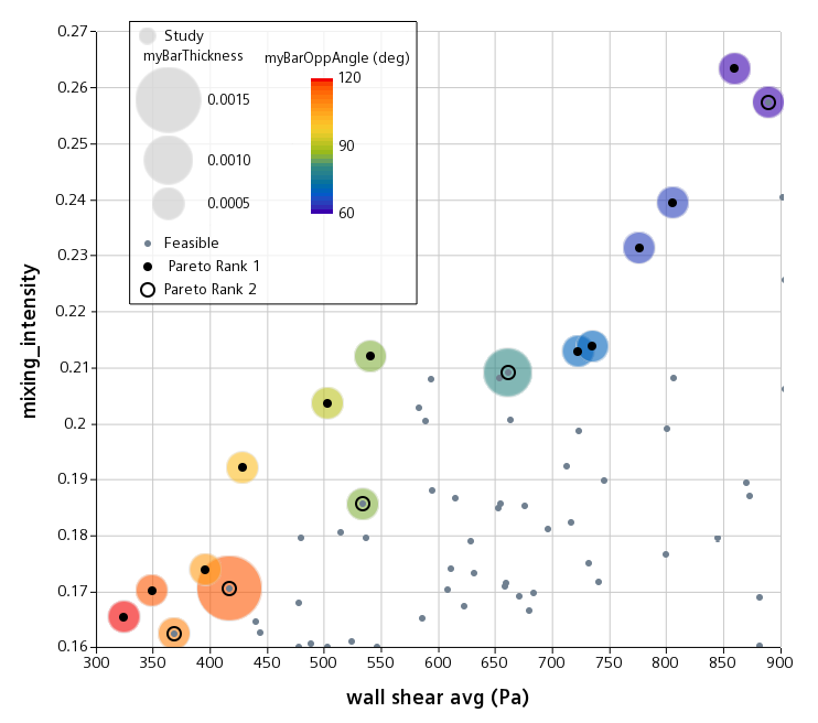
In his recent webinar [From design exploration to design thinking in 100s of simulations], my colleague Matt Godo walked you through a marvelous static mixer Pareto optimization study. In this case, our objective is to find the right set of design parameters to maximize the level of mixing while not exposing the material to damaging high wall shear. The bubble plot below helps us to quickly identify families of designs while understanding trade-offs among the 192 variants generated. The bubble size shows us the influence of bar thickness while the bubble color lets us see the influence of the opposing angle between adjacent bars.
We can see that the angle parameter has a clear influence on the results, with three families of designs that stand out. A red family, a green one and a blue one. A high angle triggers low mixing intensity and low wall shear stress. A low angle increases the mixing intensity at the expense of the wall shear stress. Identifying these families will help the engineers better understand the influence of parameters on responses. And, ultimately, help to make the right compromise in their final design decisions. In this plot, we also have a fifth dimension helping to identify the Pareto rank of the designs with inner black dots or circles. Rank 1 designs are the high performing ones, forming the famous Pareto front, whereas rank 2 designs are the second-best performing ones.
Bubble plots – a key to tackle big data analysis
Another interesting showcase for the benefit of bubble plots when post-processing CFD results is the Piccolo tube optimization. It is aiming to improve the heat transfer of an aircraft ice protection system. In this case, our objective is to maximize the average temperature while respecting minimum and maximum temperature constraints and minimizing the related standard deviation.
Again here, bubble plots are the key to tackle big data analysis. Again, they help us understand our product behavior across the design space by identifying families of designs and associated trends. The first plot highlights the influence of the pitch 1 parameter on our average temperature objective and maximum temperature constraint.
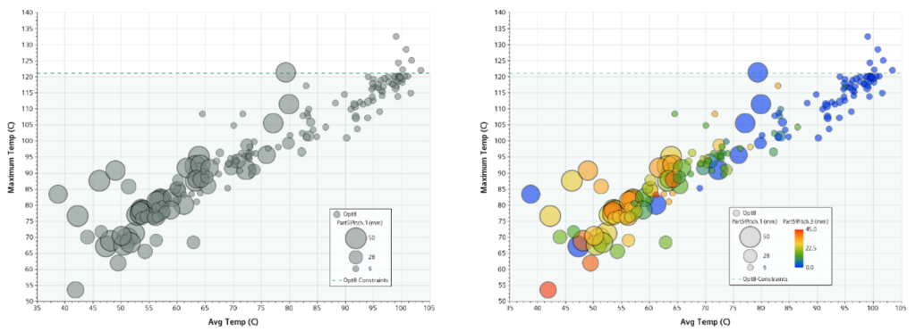
Average temperature vs maximum temperature for
[pitch 1] parameter (left) and [pitch1 & pitch 5] parameters (right)
Courtesy of Honda
We clearly see too families of designs for this parameter. The first family is defined by a high value for this parameter (large bubbles) and gets far away from the maximum temperature constraint. This, however, comes at the expense of the average temperature which is not maximized. The second family is defined by a low pitch 1 parameter value (small bubbles) which this time reaches the objective of maximizing the average temperature. Yet, this comes with a high risk of violating the maximum temperature constraint.
Adding another parameter to the plot will also help us to understand the interaction of these two parameters and the responses at a glance. In this case, we added the pitch 5 parameter with the bubble colors. the same trends than the pitch 1 ones stand out with a blue family (low pitch 1 values) and an orange family (high pitch 1 values). These two plots confirm the fact that both pitch 1 and pitch 5 parameters are high influencers on our objective.
Blowing bubbles is not just a fun activity for kids – it’s a serious engineering tool
Bubble plots catch your attention by visually revealing information that is hard to extract using regular 2D plots. They provide a fact, practical way of analyzing complex results or large datasets to efficiently identify and communicate trends. So let’s dive back in our childhood by blowing bubbles in Simcenter STAR-CCM+! Because blowing bubbles is not just a fun activity for kids – it’s a serious engineering tool!
Until the upcoming release on June 24th, learn more about the outstanding post-processing capabilities of Simcenter STAR-CCM+, e.g. Collaborative Virtual Reality, Realistic Rendering, Advanced Animation Techniques


Comments
Comments are closed.