Announcing new upgrades to Dashboard Designer
In early 2023 Siemens rolled out Dashboard Designer, a paid add-on app to Insights Hub, which revolutionized the way Insights Hub users can view data, allowing you to create simple yet powerful dashboards. Now we’re excited to announce major feature upgrades.
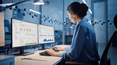
For Insights Hub users, the dashboard functions as the heart of the solution, containing data visualization panels such as graphs, pie charts and tables. This captures all the quick information you need for visualization and reporting and provides a simple overview of KPIs and the most important information for users, teams, departments and companies. You can select between discrete, one-dimensional, two-dimensional and even three-dimensional visualizations and drill down to even more detailed dashboards. All this information can be easily gathered in reports for senior management, ensuring that only the most recent data is being shared and assessed.
What’s in the latest version of Dashboard Designer?
The full, paid add-on version of Dashboard Designer offers several feature upgrades:
Upgrade #1: Some of the simple visualization panels – such as gauges, graphs, pie charts and tables – are getting significant upgrades, making them more visually appealing and user-friendly. These panels are essential when exploring time series (structured) data for simple asset monitoring use cases.
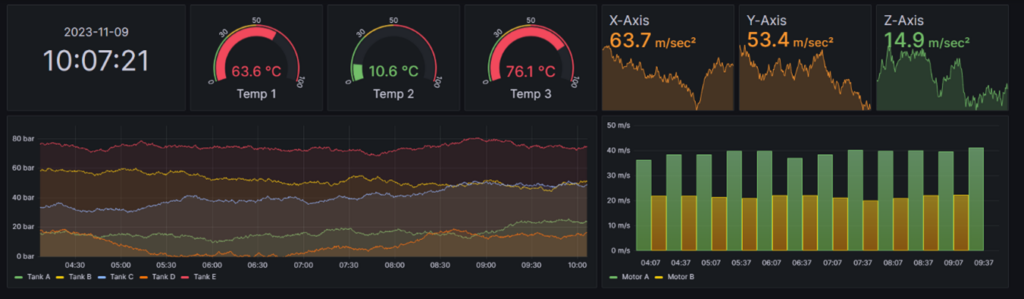
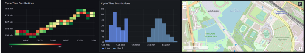
Upgrade #2: More advanced visualization panels, such as heatmaps, histograms and geomaps, are also being introduced to Dashboard Designer. You will discover actionable insights by combining structured or unstructured (Data Lake) data and business-specific KPIs of various assets. For example, the Heatmap panel, which utilizes sensor, color coding and drill down functions, is being completely reworked. You can find suspicious hot spots in a color-coded heatmap by day, which makes anomalies in the data much more visible than sifting through days’ worth of data. From there, drill down even further to other dashboards for further inspection.
Upgrade #3: Dashboard Designer also now features developer (Maker) visualization panels. In this feature, makers have access to a more comprehensive toolkit that leverages SVG, HTML, CSS and JavaScript to create custom visualizations – which can’t be expressed as standard visualizations – precisely tailored to meet your unique requirements.
For instance, SVG allows you to re-use existing technical drawings or shopfloor plans, which can be re-colored with CSS and HTML. JavaScript allows you to create interactions such as navigations or even animations.
Explore all the standard features of Dashboard Designer
As with all Insights Hub apps, getting started is easy! Starting from the launch pad, just select the Dashboard Designer app. It’s also integrated right into many Insights Hub apps such as OEE Hub, Quality Prediction Hub, etc., so in that case no separate subscription is necessary.
Setting up your dashboard is as simple as choosing the modules that are right for you and rearranging them until you have the layout you want. We recommend graphs as the first choice to visualize historic and current Time Series data, as well as clocks, pie charts, tables, gauges, and dashboard lists that allow you to create navigation to other dashboards.
Both structured and unstructured data can be visualized through these panels. The app guides you through setting up assets, aspects, variables, KPIs and time frames. Both simple and advanced visualizations are available for any use case, and you can combine these ready-to-panels with your own customized ones using the SVG and JavaScript capabilities described earlier. Voila! You’ve set up the dashboard configured to the needs of your team with no expert knowledge necessary.
The app also offers guided access to Time Series and Integrated Data Lake (IDL) data, allowing you to create queries easily, even without prior knowledge of query languages. Improve response time through predefined data sources and find query bottlenecks and errors with query inspection tools. Finally, different users can each have their own dashboard views with more or fewer details, depending on their role. Since everyone has access to the same information at the same time, it’s a handy way to emphasize where user action is needed for greater accountability.
How to get Dashboard Designer
The new features in Dashboard Designer are already available as an early access program. To participate, please get in touch with our Siemens team of experts and reach out for a demo.
Want to try Insights Hub for free? Start today with Start for Free.