New in Solid Edge 2025: UI/UX workflow enhancements
Take a deep dive into everything new in Solid Edge 2025 with a series of blog posts focused on the exciting new features and enhancements in this year’s release. In this blog, learn more about the improved user experience in Solid Edge 2025.
Customize your design experience and enhance workflows
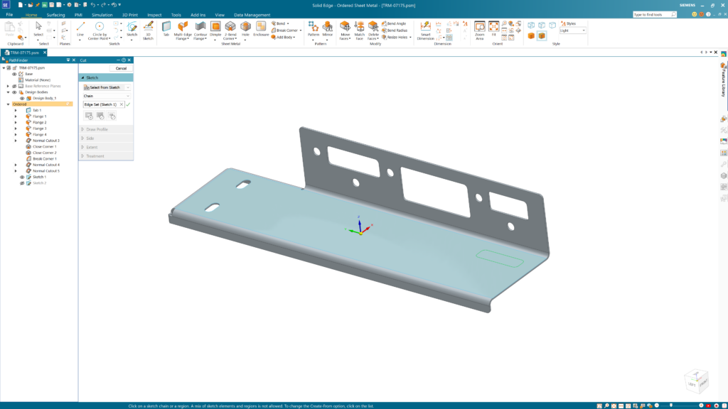
New customization options make it easier for both new and experienced users to tailor their Solid Edge experience, delivering a more intuitive and personalized design environment. With a fresh redesign of many Vertical Command Bars, streamline your workflow and make the most of your screen space.
The new command buttons and Auto Hide Vertical Command Bars option allow you to maximize the graphical area on your screen. You can move specific options from separate dialogues onto the Vertical Command Bars to prevent having to open additional dialogues and reduce clicks and cursor travel. The new reduction in size of the parts list properties and drawing view properties dialogs maximizes the graphical space on your screen and improves the accessibility of all the available options and properties.
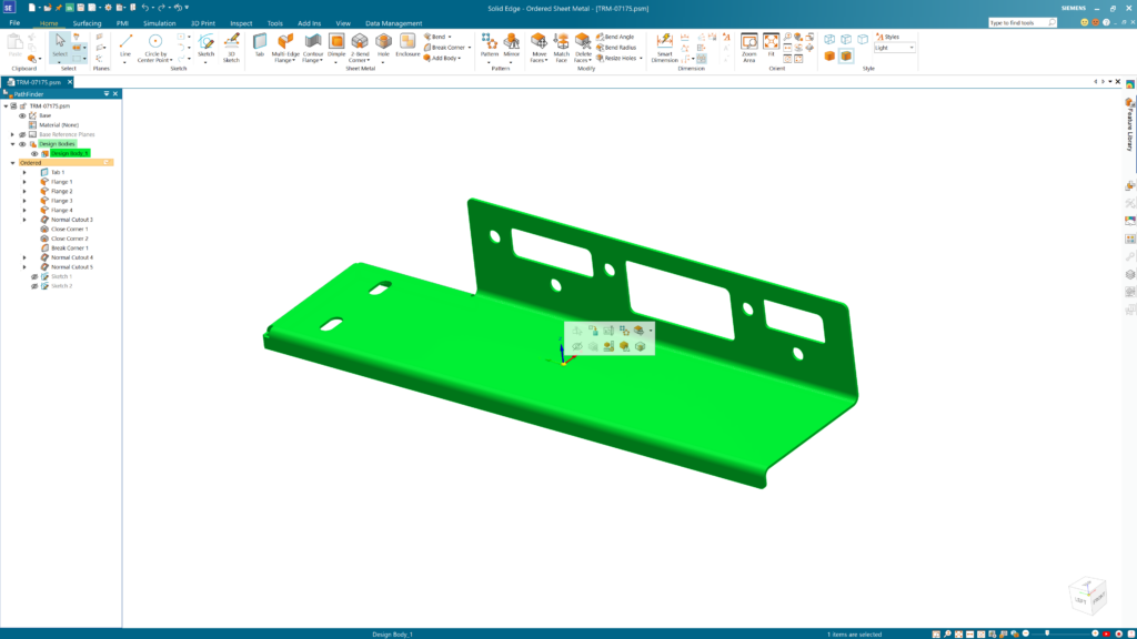
Enhancements to the Context Toolbar (CTB) include new settings that allow you to choose if the CTB will fade when it isn’t being used and if the CTB will generate with a right mouse click. With improved command placement, the CTB is consistent across all environments and is available with every type of rolled back entity in Pathfinder. The CTB can also be accessed with a right mouse click in the Draft, Ordered Part and Assembly environments. The new, larger icons and button sizes in the CTB make it easier to find the commands you’re looking for. These enhancements provide enhanced user flexibility, increased consistency and usability.
Improved command icons now scale better for 4K monitors. This lowers the overall file size as new icon sizes do not need to be continuously added in future settings. In the drawing view properties dialog, the options on the general tab have been rearranged to reduce the height of the dialog, resulting in better visibility in all possible desktop resolutions. The docking pane now uses modernized icons and matches the new icon style seen across all environments, making it easier for you to search and recognize icons as you design.
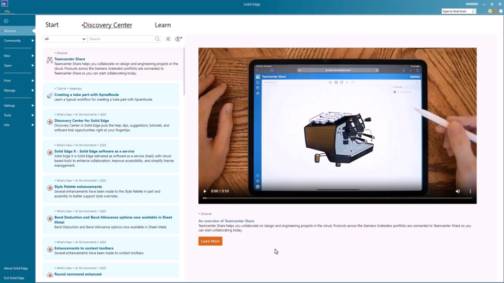
The Discovery Center provides access to a wide range of resources and learning materials within Solid Edge. It is a centralized hub for tutorials, trials, documentation and community resources. Discovery Center offers various learning paths and modules that cater to different levels of expertise, allowing you to start with the basics and progress to more advanced topics. It includes interactive tutorials, videos and step-by-step guides to assist users in mastering different aspects of Solid Edge. Discovery Center also features news and updates about the latest releases, blogs and events near you. It serves as a valuable resource for staying up to date with all things Solid Edge and connecting you with the community.
Join the conversation
All of these new features and enhancements in Solid Edge 2025, along with many more, were announced during our live premiere on October 23, 2024.
To learn more about what’s new in the Solid Edge 2025 release, click here.
There are a lot of ways to hear what others are saying about the upcoming release and to connect with other Solid Edge enthusiasts online.
Here are a few ways to join the conversation right now:
- Join our vibrant online Solid Edge Community to connect and interact with other Solid Edge users.
