Does this color look good on me?
By David Abercrombie and Alex Pearson – Mentor, A Siemens Business
Any given layout has multiple coloring configurations that pass multi-patterning design rule checks (DRC). However, selecting the optimum coloring solution can improve both manufacturing yield and performance margins in designs. Luckily, there’s the Calibre Multi-Patterning automated coloring solution…

Engineers who work with multi-patterned designs know that any given layout will usually have many different coloring (mask assignment) solutions that pass all the rule checks. What they (and you) may not realize is that one of those coloring choices may actually be better than the others in terms of manufacturing success and chip performance. Why, you ask? Pull up a chair, and we’ll explain.
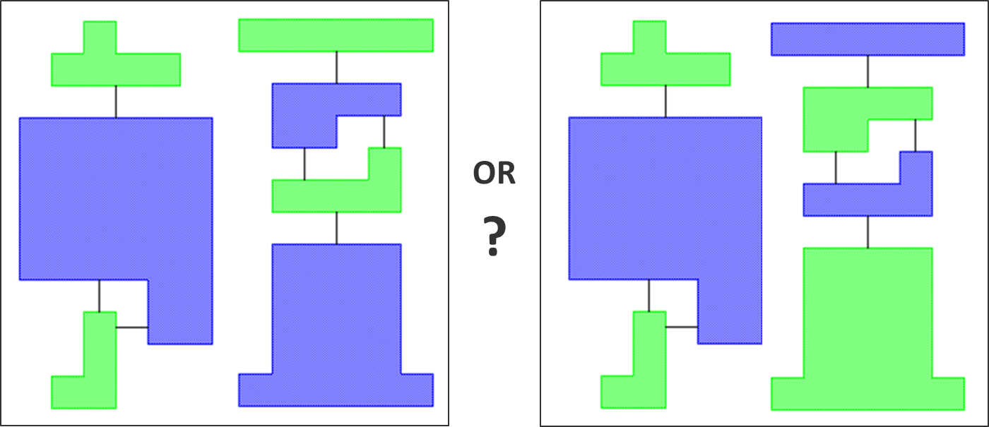 Color density is the first reason for color optimization. Each color assignment in a multi-patterned layout identifies a different mask—everything assigned to green goes on mask 1, everything assigned to blue goes on mask 2, and so on. In multi-patterning, the goal is to get to the end of processing all those masks, and have all the shapes perform as if they were all created on one mask with the same process biases and same variations from the drawn shapes. To make that happen, all the masks should have a similar distribution of shapes. If one mask has all the shapes clustered together, while another spreads them out evenly across the entire mask area, the process biases (and hence the results) are going to be very different.
Color density also applies to local areas of a layout. Sometimes the ratio and placement of small vs. large polygons in a given configuration of the design significantly affect the final color density of that section. Selecting a color assignment that results in a more uniform color density can better regulate the bias impacts on these shapes.
But wait, you say! What about that ginormous polygon stuck in the middle of my layout? It has to be all one color, so how am I going to balance my color density and still satisfy the rule checks? Would we let you ask that question if we didn’t have an answer? And a clever answer, at that. In this case, you can lay a grid of small polygons assigned to the opposite color on top of the large polygon. These small polygons have no real purpose in the end result—they don’t create openings—but when printing the two masks, they add shapes to an otherwise empty region of their assigned mask. This helps ensure the two masks have similar densities in this region.
The second reason for color optimization is color regularity, or repetitive coloring patterns. These can be especially useful in memory applications (where the regularity helps the OPC process generate more consistent results) and sensitive analog circuits (where symmetry is critical). Adding constraints to your coloring requirements can ensure color regularity where needed.
Our third and final reason is DFM-aware coloring. For example, a specific coloring may prevent a lithographic hotspot from forming, or it can enable the use of an OPC recipe on that configuration. However, if that configuration is defined as a pattern, and repeated throughout a design in various instantiations (rotated, reflected, etc.), it must be colored the same way every time to ensure the hotspot mitigation can be applied consistently.
So, do you want to know more? See some examples of what we’re talking about? Learn how you can improve results in your multi-patterned designs using color optimization techniques? Check out our white paper, Color Optimization Considerations in Multi-Patterning, for all the details. If you still have questions, give us a shout!


Comments
Leave a Reply
You must be logged in to post a comment.
Paper is very useful and value additional in understanding dummy fill or dummy pattern insertion in order to have process margin in CMP planarization and RIE.