Red Hot Electronic Thermal Analysis?
The etymology of the phrase ‘red hot’ dates back to the 14th century describing the colour attained by metal as it is heated. When attributed to people it can euphemistically be used to describe passion and attractiveness. Any colourful picture output from a numerical thermal simulation of an electronics system will have red depicting hot and commonly blue to show cold. There are other colour map options though..
FloTHERM has a range of colour map options in it’s ‘Visual Editor’ post processing gui. Despite the fact that colour is (mis)spelt color in the gui it is easy to find and experiment with changing the colour scale used on screen. A colour map is simply a map of different colours to different numerical values of temperature. There are fifteen different colour maps to choose from. Here is a selection of some of them applied to a PCB level model:
“Spectrum” 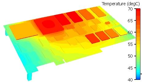
“FloMotion32” 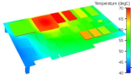
“VisStandard” 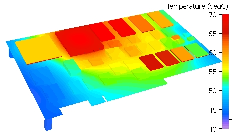
So far so good, they’re all quite similar, the main differences being in the colour banding in the mid temperature ranges. Now let’s start to go a bit off-piste:
“Menthol” 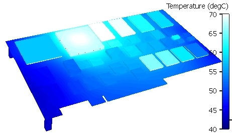
“Red Scale” 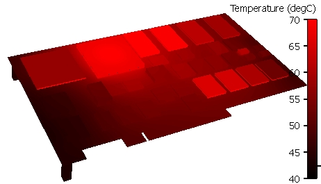
“Grey Scale” 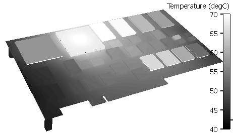
“Iron” 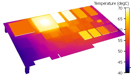
Somewhat iron-ic that the Iron scale doesn’t have a red in it 😉
Finally how’s this for a useful colour map:
“Black” 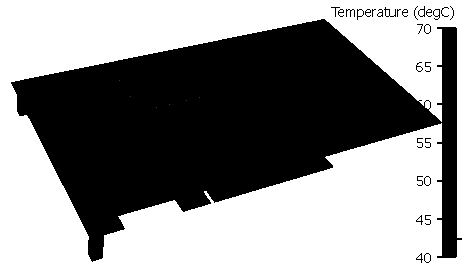
You might laugh but there are times this is useful, not so much for surface temperature colouring, more for flow particle and arrow colouring.
You too can experiment with your favourite colour map FOR FREE! Either read this blog or follow this link to download the fully functional standalone version of FloTHERM’s post processing window; FloVIZ.
14th July 2010 Hampton Court