Sneak Preview – Visual Refresh Polarion 20
Polarion’s next release will be a special one because we are making some significant changes to the visual look & feel of Polarion’s UI ( User Interface). We are excited to give you a sneak preview and uncover some of the new visual updates for the next release: Polarion 20 R1 coming up in April.
This UI refresh is part of a broader Polarion UX Refresh initiative which was already kicked-off by extensive UX research. These enhancements are divided into two phases. The UI is how the application visually looks and the UX (or User Experience), is how the application functions and how easy Polarion is to work with. They are two sides of the same coin and contribute directly to an improved, easier and more engaged overall user experience.
PHASE I – Visual UI Refresh
The UI refresh consists of an update of colors, typography, and icons. This phase is a prerequisite for PHASE II to ensure a smoother transition for the user from current to future re-envisioned Polarion.
PHASE II – Functional UX Enhancements
The functional UX revamp will be divided into three key areas
- Streamlined flows of important user routes and common tasks
- Performance boost for data loading and response time
- Componentization to unify behavior and interaction across Polarion
Stay tuned as we will go into more detail on PHASE II in future UX blogposts.
Now with that said, let’s have a sneak peek at Polarion’s new UI.
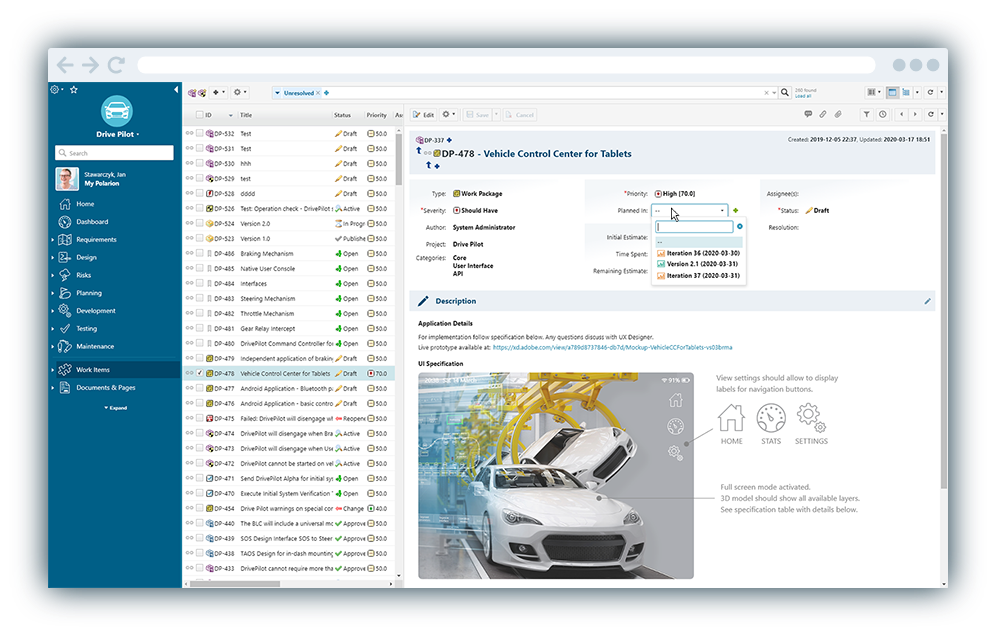
The New Refreshed Polarion UI
The new visual updates of Polarion’s user interface are motivated by several reasons. It was already mentioned that visual refresh is an enabler and the first phase of broader user experience refresh. Another strong reason behind the update of the current user interface is that we wanted to provide a more visually unified experience, more modern, fresh and aligned visually to the broad software portfolio of Siemens Digital Industries Software. By doing this, our users can see significant enhancements in these areas:
1 / More internal consistency – With these visual updates we are progressively removing visual inconsistencies within Polarion’s user interface, this is increasing the overall user interface clarity and memorability for its users. A unified User Interface (UI) will always benefit the overall user experience.
2 / More portfolio consistency – By aligning the look and feel to the visual identity for Siemens Industry Digital Software we are aiming towards unified user experience across the entire portfolio.
3 / Refreshed look and feel – In Polarion we believe by this UI refresh we also bring to the table a more modern look which in turn can be perceived as more pleasant and enjoyable. We know that this can be subjective and this is why we also spent significant time listening to the feedback of our users.
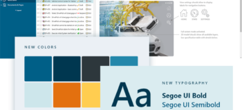
Updated Color Palette, Typography, and Icons
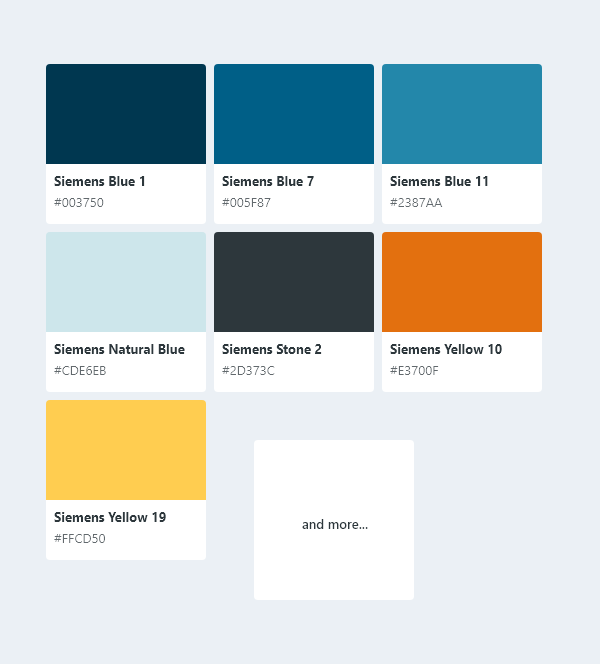
NEW COLORS
Themes are used in the Siemens Digital Industry Software User Experience policies as a type of shortcut to provide coordinated sets of colors in the interface. There are color guidelines for individual interface components, as well as for the entire application frame. |
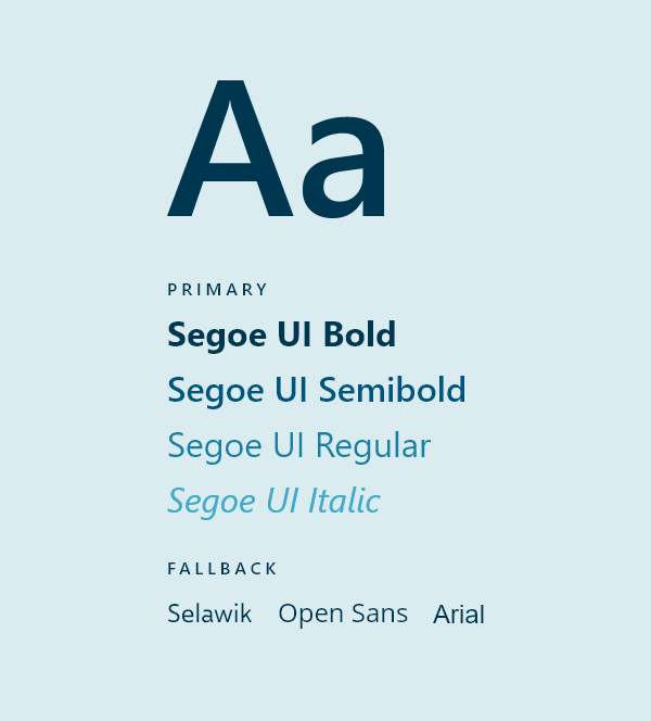
TYPOGRAPHY
Typographic design chosen for Polarion is designed to provide a clear visual hierarchy, as well as, a consistent and simple presentation. This is reflected in the choice of Segoe UI. |
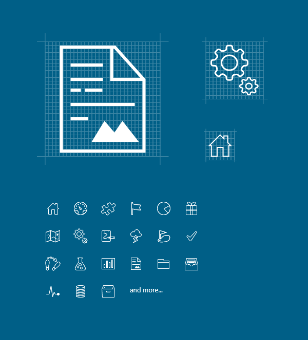
NEW ICONS IN NAVIGATION
Polarion product icons can often overlap in functionality and work environment, so it made sense to keep images consistent. The new series of icons now have a common appearance such that they are recognizably related. All new navigation icons now follow the same design language, construction, and characteristics. |
Other Noticeable Visual Enhancements
The UI refresh also created other noticeable visual enhancements that would benefit users in Polarion 20. Let’s highlight a few:
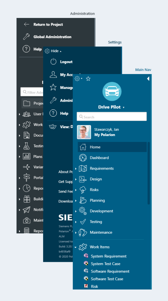
NAVIGATION PANEL
Visually better distinction between navigation and the content.
Clearer distinction between main navigation and administration views. |
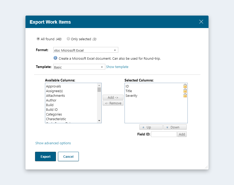
DIALOGS
Primary action of dialogs visually more prominent and better distinction of dialog frame from content.
Unification of dialog positioning to the center of the browser window.
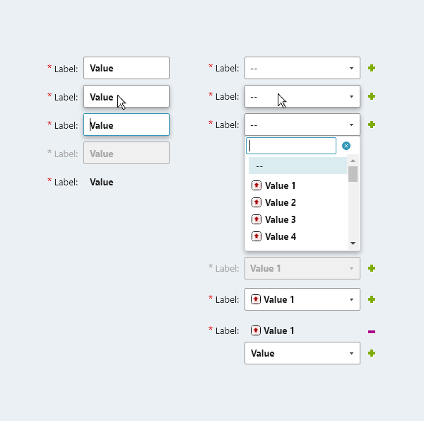
FORM CONTROLS ON WORK ITEMS
Increased clickable area for better interaction and control.
Unification of sizes and visual look. |
Want to see more and give us your feedback?
We still have some time until the release of Polarion, but we hope you are now looking forward to the new changes to Polarion’s UI as much as we enjoyed working on it!
If you are interested in a live demo of the new Polarion UI, contact our design team at jan.stawarczyk@siemens.com and we will arrange a meeting where you will be able to see all upcoming visual updates.
Your feedback is important to us
How did we do on the UI refresh? This short survey just has 3 questions and will only take one minute of your time, but will be tremendously valued and appreciated by us, thank you.
Take the survey