Graphical medicine
I am very sceptical when I hear the term “graphical interface”. All too often I have been frustrated and irritated by a webpage with flashing, animated GIFs or by a “user friendly” interface on a device that takes for ever performing somersaults and cartwheels instead of letting me get on with the task in hand. Of course, these are examples of badly designed graphical interfaces. I would like to talk a little about how a good GUI might be designed and an application area where I feel good GUIs are really beneficial …
Designing a good GUI is problematic because it requires 2 completely separate skill sets: graphical design and programming. Very few people are able to say that they are really skilled in both these areas. [In my opinion, as one is “left brained” and the other “right brained”, this is unsurprising.] So, the key to success is to divide the process in 2 and have an “artistic” person do the graphics themselves and a software engineer handle the coding. This is easier said than done, because most graphics packages do not expose such a separation. A notable exception is Mentor Graphics Inflexion, where the definition of the GUI requires no programming and is quite independent of the underlying code. I guess there is now no excuse for bad GUIs!
For many applications, a GUI is nice to have and may aid marketing of a device, but it may be argued that it is far from essential and may not improve the user experience. An area where I feel that this is not the case is medical systems. A medical instrument with a graphical display may be better in 2 respects: safety and patient comfort.
The first angle is clear enough. Patient safety is of paramount importance and the wonderful benefit of such “intelligent” devices is that they can monitor the patient accurately and consistently 24/7 in a way that no human could manage. Many medical instruments are quite complex and a given health professional may need to work with numerous different devices in a given day. The problem is that they must all be set up correctly, which is where human error may occur. The design of the UI is the golden opportunity to mitigate such errors. Even if errors can never be totally eliminated [“to err is human …”], at least a logical step by step process can keep them to a minimum.
Patients are almost always under stress. Being unwell is obviously stressful and a hospital environment may be far from comforting. A smart instrument, with a well designed GUI can help to alleviate such stress at least a little. Stress is largely caused by feeling out of control. If the patient can clearly understand their status from the display on an instrument, they have a feeling that just a little more control has been returned to them.
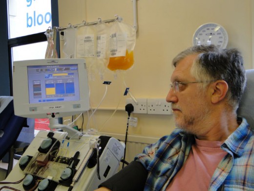
I have personal experience that confirms this. Once a month or so, I spend a couple of hours hooked up to a medical instrument. Fortunately, this is not because I am unwell – I donate platelets, which I have written about before. The machine extracts some blood from my arm, removes the platelets and returns the rest to my body. This is repeated until enough cells have been harvested. It is quite painless, but rather boring sitting still for so long. The idea of ones blood flowing out and back again is also a bit scary. I find great comfort in the graphical display on the machine. It shows me how the donation is progressing, how much longer it should take and graphically illustrates the draw and return pressures. Even though the staff at the donation center are very friendly and informative, the machine really gives me the feeling that I know what is going on. I can almost say that I enjoy the experience!